
AHAVA
Product Campaign
The Israeli cosmetics company, specializing in skin care, was looking for new designs for two different products to then promote on social networks: a facial cream for mature skin and another for young skin,
with proper packaging design and cream characteristics.
Concepts
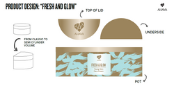
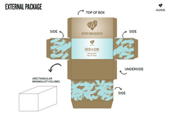
The Young Skin Cream would have moisturizing, glowing and youth preserving effects.
The design and texture should show freshness, similar to Dead Sea mud and fresh water, and luminosity,
with a bright version of the main color of the ahava graphic charter. Simple and geometric shapes
have been opted for the packaging, following the graphic trend of 2021.
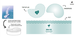
For the Mature Skin Cream, the emphasis was placed on other properties: moisturizing and firming.
The modern geometric shapes and glowing effect were kept, but other natural elements were chosen
to inspire the design, such as mineral salts and marine pearls.
 |  |
|---|
Packaging Designs
 |  |  |
|---|---|---|
 |